Fourier transforms: animations
Introduction 🎍
Objectives 🎯
Create a (complex-valued) signal
Compute its Fourier spectrum
Vizualize the signal and its spectrum in 2D space
Repeat 1-3 for different signals
Example 1. Positive harmonics
Let \(s(t)\) be a complex-valued signal (a sequence of complex numbers).
A complex signal consists of two (independent) parts: real and imaginary. \(s(t) = \mathcal {Re}(s(t)) + i\mathcal {Im}(s(t))\) .
\( x = 4\cos(t) - 2\cos(2t) - \cos(4t) \)
\( y = 4\sin(t) - 2\sin(2t) - \sin(4t) \)
\( s = x + i y \)
import numpy as np
from numpy import sin, cos, pi, abs, angle
import matplotlib.pyplot as plt
dt = pi/31
t = np.arange(0, 2*pi, dt)
x = 4*cos(t) - 2*cos(2*t) - cos(4*t) # real part
y = 4*sin(t) - 2*sin(2*t) - sin(4*t) # imaginary part
signal = x + 1j * y
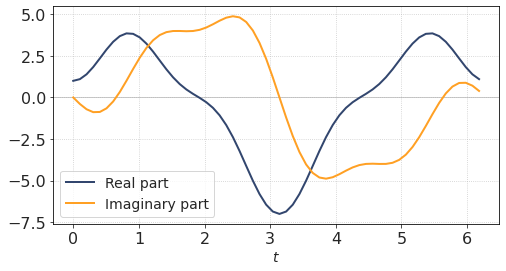
Of course we can always plot two graphs, \(\mathcal {Re}(t)\) and \(\mathcal {Im}(t)\), independently
plt.figure(figsize = (8, 4))
plt.plot(t, np.real(signal), label = 'Real part')
plt.plot(t, np.imag(signal), label = 'Imaginary part')
plt.legend()
plt.xlabel('$t$')
plt.axhline(0, lw = 1, c=[0.8,0.8,0.8],zorder = 0)
plt.show()
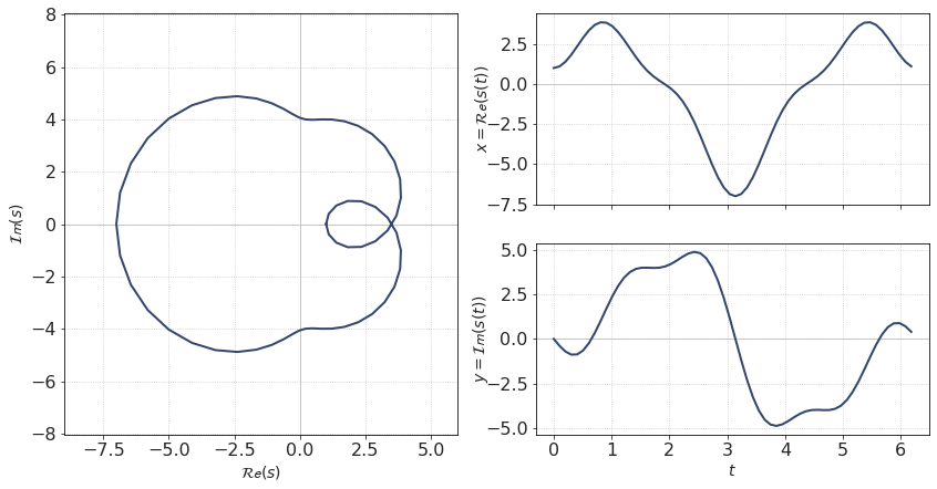
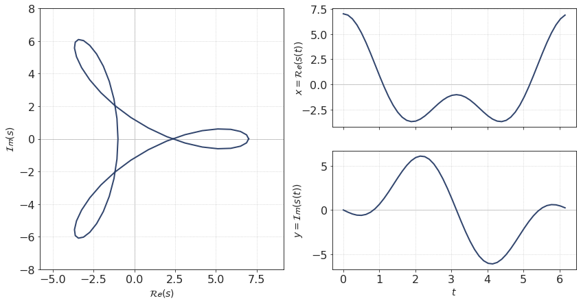
A common way to plot a complex signal is to plot a 2D curve on a complex plane, where real part is plotted along horizontal axis and imaginary part is plotted along vertical axis.
Thus, the signal \(s(t)\) will be represented by a sequence of points on a Cartesian plane. These points (hopefully) will form a line.
Since our signal is a trigonometric function, the lines are smooth and even beautiful.
ax1 = plt.subplot(1,2,1)
ax2 = plt.subplot(2,2,2)
ax3 = plt.subplot(2,2,4)
ax1.plot(np.append(x, x[0]),np.append(y,y[0]))
ax2.plot(t, x)
ax3.plot(t, y)
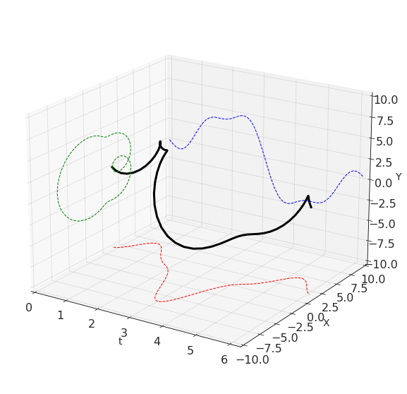
By the way, we can plot this graph in 3D
fig = plt.figure(figsize = [10,10])
ax = plt.axes(projection='3d', azim = -57, elev = 20)
ax.plot3D(t, x, y, 'k', lw=3)
ax.plot3D(t, 10+0*x, y, 'b', ls='--', lw = 1)
ax.plot3D(t, x, -10+0*y, 'r', ls='--', lw = 1)
ax.plot3D(0*np.append(t, t[0]), np.append(x, x[0]), np.append(y, y[0]), 'g', ls='--', lw = 1)
ax.set_xlim(0, np.max(t))
ax.set_ylim(-10, 10)
ax.set_zlim(-10, 10)
ax.set_xlabel('t')
ax.set_ylabel('X')
ax.set_zlabel('Y')
plt.show()
Signal spectrum:
from scipy.fftpack import fft, ifft
from scipy.fftpack import fftfreq, fftshift
S = fft(signal)
W = abs(S)
P = angle(S)
fr = fftfreq(len(signal), d = dt)
The values in the result are strangely sorted (due to some technical issues in FFT implementation): first sample is a DC term, followed by \(N/2\) positive frequencies, and then we see negative frequencies. (See NumPy documentation for details)
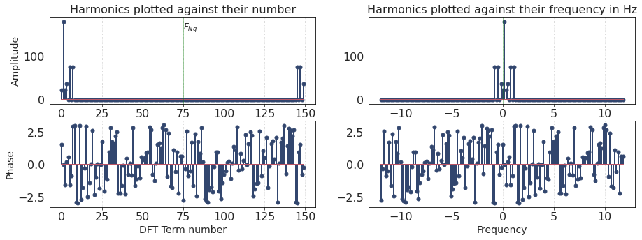
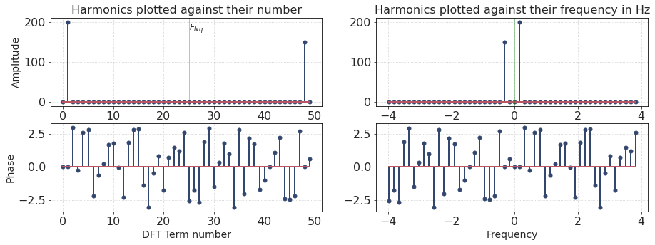
The left column in a figure below shows the spectrum in mentioned order (harmonics plotted against their number).
The plots on the right are more intuitive because the spectrum is re-sorted from negative to positive frequencies (harmonics plotted against their frequency in Hz).
f, ax = plt.subplots(2,2, figsize = [15,5])
ax = ax.ravel()
ax[0].set_title('Harmonics plotted against their number')
ax[0].stem(W)
ax[0].text(len(W)//2, 0.9*np.max(W), '$F_{Nq}$', ha = 'left', fontsize = 12)
ax[0].axvline(len(W)//2, lw = 0.5, c = 'g', alpha = 0.7)
ax[0].set_ylabel('Amplitude')
ax[2].stem(P)
ax[2].set_xlabel('DFT Term number')
ax[2].set_ylabel('Phase')
ax[1].set_title('Harmonics plotted against their frequency in Hz')
ax[1].stem(fr, W)
ax[1].axvline(0, lw = 0.5, c = 'g', alpha = 0.7)
ax[3].stem(fr, P)
ax[3].set_xlabel('Frequency')
plt.show()
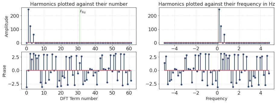
The spectrum contains many samples, but only three of them have a non-zero amplitude. Looks like our signal is made up of three harmonics corresponding to positive frequencies.
The frequency of each harmonic depends on its index number. Here we have harmonics 1, 2, 4. Their amplitudes are proportional to {4, 2, 1}, respectively. This, by the way, corresponds to the formula representing our signal.
Animation
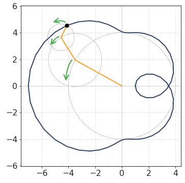
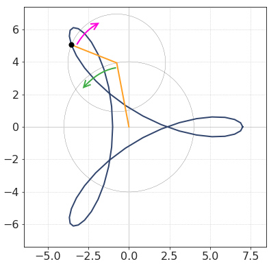
Each harmonic can be related to a line segment rotating with a given frequency. The signal \(s(t)\) is formed like a vector-sum of all segments/harmonics.
Below there are rather bulky cells with animation code. I chose to hide them by default
%%capture
from matplotlib import animation
from IPython.display import HTML
nframes = len(x)
frame_step = int(len(x)/nframes)
frame_interval = 50
fig = plt.figure(figsize=(14, 7))
ax = plt.subplot(1,2,1)
ax2 = plt.subplot(2,2,2)
ax3 = plt.subplot(2,2,4)
ax.axvline(0, lw = 1, c=[0.8,0.8,0.8])
ax.axhline(0, lw = 1, c=[0.8,0.8,0.8])
ax2.plot(t, x)
ax3.plot(t, y)
ax2.axes.get_xaxis().set_ticklabels([])
ax.set_aspect(1, adjustable='datalim')
ax.plot(np.append(x, x[0]),np.append(y,y[0]))
line, = ax.plot([], [], lw=2)
scatter_pts = ax.scatter([], [], s = 50, c = 'k', zorder = 10)
scatter_x = ax2.scatter([], [], s = 50, c = 'k', zorder = 10)
scatter_y = ax3.scatter([], [], s = 50, c = 'k', zorder = 10)
hcircles = [plt.Circle((0, 0), 0, color='k', fill=False, lw = 0.2) for i in range(len(x))]
for hcircle in hcircles:
ax.add_patch(hcircle)
ax.set_xlim([-9,6])
ax.set_xlabel('$\mathcal {Re}(s)$')
ax.set_ylabel('$\mathcal {Im}(s)$')
ax2.set_ylabel('$x = \mathcal {Re}(s(t))$', labelpad = -5)
ax3.set_ylabel('y = $\mathcal {Im}(s(t))$', labelpad = -5)
ax3.set_xlabel('$t$')
fig.align_labels()
# fig.tight_layout()
# initialization function: plot the background of each frame
def init():
line.set_data([], [])
return (line,)
def animate(i):
P_i = i/len(x) * 2*pi * np.arange(len(x)) + P
amp_i = W/len(x)
x_i = np.zeros_like(W)
y_i = np.zeros_like(W)
for j in range(len(S)//2):
x_i[2*j] = amp_i[j] * cos(P_i[j])
y_i[2*j] = amp_i[j] * sin(P_i[j])
x_i[2*j+1] = amp_i[-j-1] * cos(P_i[-j-1])
y_i[2*j+1] = amp_i[-j-1] * sin(P_i[-j-1])
linepoints_x = np.insert(np.cumsum(x_i), 0,0)
linepoints_y = np.insert(np.cumsum(y_i), 0,0)
for j in range(1, len(linepoints_x)-1):
hcircles[j].set_center((linepoints_x[j], linepoints_y[j]))
hcircles[j].set_radius(np.sqrt(x_i[j]**2 + y_i[j]**2))
line.set_data(linepoints_x,linepoints_y)
scatter_pts.set_offsets((linepoints_x[-1], linepoints_y[-1]))
scatter_x.set_offsets((t[i], x[i]))
scatter_y.set_offsets((t[i], y[i]))
return line,
anim = animation.FuncAnimation(fig, animate, init_func=init,
frames = nframes, interval = frame_interval, blit=True)
HTML(anim.to_jshtml())
Observations
There are indeed three harmonics (segments) that form this signal
Their lenghts are 4, 2 and 1.
They are rotating in the same direction (counterclockwise), but at different frequencies
Negative frequencies?
Before we proceed, we need to discuss the meaning of “negative frequencies”.
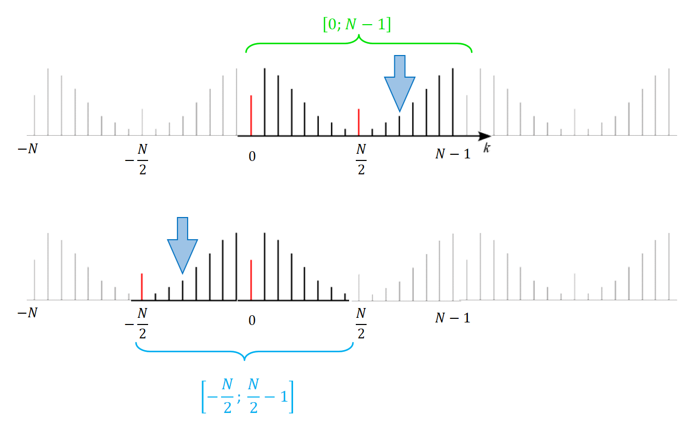
Recall that Fourier spectrum is periodic. It means that negative frequencies are, in fact, the same thing as “ultra-high” frequencies (harmonics with frequency higher than Nyqist frequency). This fact has a cool meaning in terms of rotating lines.
Imagine we have a single rotating line. We are plotting it frame-by frame, and it turns a little bit every frame. But what if it rotates very fast? By very I mean that its frequency is higher than Nyqist frequency. In this case it makes more than half a turn every frame.
If frequency is significantly higher than Nyqust frequency, the line will make almost a full circle each frame. And then it will appear as rotating backwards.
Since the frequency spectrum is periodic, this conclusion stays true for ‘negative’ harmonics.
Thus, negative harmonics can be seen as line segments rotating in the opposite direction.
For example, consider a harmonic marked by a thick blue arrow in the picture below. It can be treated as either negative (\(f < 0\)) or high-frequency positive (\(f > f_{Nq}\)) .
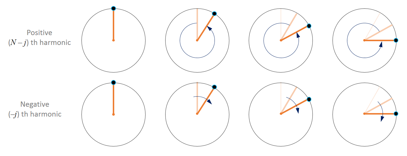
In the picture below, you can see the illustration of this concept.
In the upper row, a rapidly spinning positive harmonic is depicted.
In the lower row, the same line segment is slowly rotating in the opposite direction.
So there is no need to be afraid of negative frequencies. They are just line segments rotating backwards (clock-wise).
Example 2. Positive and negative harmonics
The next signal is designed to contain negative harmonics.
dt = pi/25
t = np.arange(0, 2*pi, dt)
x = 4*cos(t) + 3*cos(2*t)
y = 4*sin(t) - 3*sin(2*t)
signal = x + 1j * y
The spectrum of this signal:
This signal is formed by two harmonics only:
Index = 1, Amplitude: 4
Index = -2, Amplitude: 3
Animation
We see two line segments rotating in opposite directions with different frequencies.
While the first one (index = 1, amplitude = 4) makes a full circle, the other one (index = -2, amplitude = 3) makes two turns.
Example 3. Many harmonics
dt = pi/75
t = np.arange(0, 2*pi, dt)
r = 1.2 + 0.5*cos(2*t+0.2) + 1*sin(4*t+0) + 1*sin(6*t - 1.75) + 0.3*sin(t)
x = r*cos(t)
y = r*sin(t)
signal = x + 1j * y
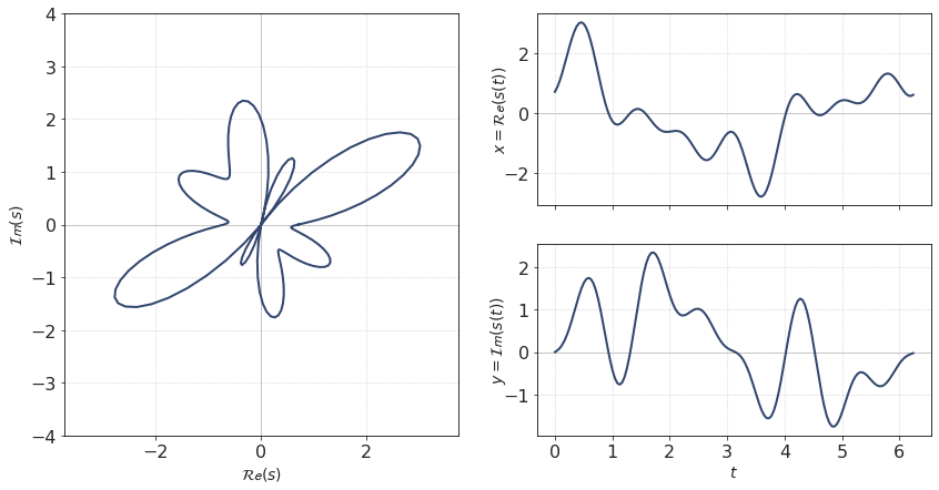
This signal is slightly more complicated. Its equation is written in polar coordinates. Its spectrum contains several positive and negative harmonics.
fig = plt.figure(figsize=(14, 7))
ax1 = plt.subplot(1,2,1)
ax2 = plt.subplot(2,2,2)
ax3 = plt.subplot(2,2,4)
ax1.plot(np.append(x, x[0]),np.append(y,y[0]))
ax1.set_aspect(1, adjustable='datalim')
ax1.set_ylim([-4, 4])
ax1.set_xlim([-4, 4])
ax1.axvline(0, lw = 1, c=[0.8,0.8,0.8],zorder = 0)
ax1.axhline(0, lw = 1, c=[0.8,0.8,0.8],zorder = 0)
ax2.plot(t, x)
ax3.plot(t, y)
ax2.axhline(0, lw = 1, c=[0.8,0.8,0.8],zorder = 0)
ax3.axhline(0, lw = 1, c=[0.8,0.8,0.8],zorder = 0)
ax1.set_xlabel('$\mathcal {Re}(s)$')
ax1.set_ylabel('$\mathcal {Im}(s)$')
ax2.set_ylabel('$x = \mathcal {Re}(s(t))$', labelpad = -5)
ax3.set_ylabel('$y = \mathcal {Im}(s(t))$', labelpad = -5)
ax3.set_xlabel('$t$')
ax2.axes.get_xaxis().set_ticklabels([])
fig.align_labels()
# f.tight_layout()
plt.show()
Spectrum:
